ShopDreamUp AI ArtDreamUp
Deviation Actions


Suggested Deviants


Suggested Collections


You Might Like…


Description
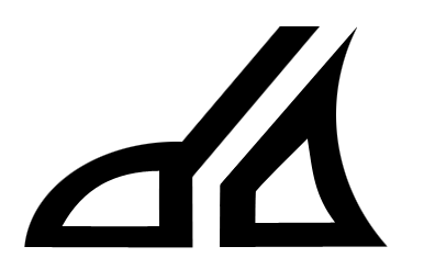
Yes yes that's my entry for the logo challenge thingy...
But let me explain it first!!
I didn't really like the new logo much compared to the old one. I understand why it's like it is because of the 'lil article dA wrote about it, but they forgot a very important fact when they made the logo;
THE BRAIN DOESN'T THINK WITH STRAIGHT LINES. The eye likes geometrical forms more but the eye and the brain work differently, so to make them both happy, we gotta make sure both of them like what they see. dA's logo is just straight lines, which may seems nice for the eye but the brain won't like it because the brain work' with squigly lines and curves.
Straight lines are also like a straight path; a path everyone follows without zigzaging. Yet us artist, we're here to prove how our style is different, how we're not just copying the person walking in front of us; yet with a straight path we can only do this, so having only straight lines in a logo asociated with ART is not really good, curved lie give a sense of freedom and originality, which is what dA is meant for.
Here the logo I made has both straight and curved lines, as well as diagonal, vertical and horisontal lines, with a slight touch of sharpness in the corner of tha "a" while the bottom of the "d" is more lumpy.
With that everyone is pleased, and I made a logo for the site I love the most :3
But let me explain it first!!
I didn't really like the new logo much compared to the old one. I understand why it's like it is because of the 'lil article dA wrote about it, but they forgot a very important fact when they made the logo;
THE BRAIN DOESN'T THINK WITH STRAIGHT LINES. The eye likes geometrical forms more but the eye and the brain work differently, so to make them both happy, we gotta make sure both of them like what they see. dA's logo is just straight lines, which may seems nice for the eye but the brain won't like it because the brain work' with squigly lines and curves.
Straight lines are also like a straight path; a path everyone follows without zigzaging. Yet us artist, we're here to prove how our style is different, how we're not just copying the person walking in front of us; yet with a straight path we can only do this, so having only straight lines in a logo asociated with ART is not really good, curved lie give a sense of freedom and originality, which is what dA is meant for.
Here the logo I made has both straight and curved lines, as well as diagonal, vertical and horisontal lines, with a slight touch of sharpness in the corner of tha "a"
With that everyone is pleased, and I made a logo for the site I love the most :3
Image size
396x255px 11.32 KB
© 2008 - 2024 kellllly
Comments18
Join the community to add your comment. Already a deviant? Log In
ooo yesh thats really good .w. n teh stuff you wrote about it with lineness too 8D mehopes you win : D 